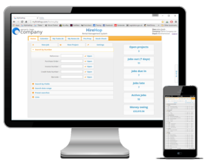
Software today should be intuitive, with a familiar workflow, look and feel. By adhering to this ethos, you can easily use the software without the need for constant referral to the manual, calling for support, or having to send staff, especially new staff, on training courses.
Customers like you told us that they wanted to avoid having to do lengthy training for every new member of staff, therefore intuitive software like HireHop enables your staff to concentrate more on business than having to wrestle with software.
We wanted HireHop to be as easy to use as possible, with a familiar look and feel to everyday software. If a software company makes it hard to see their software in action on their website, you are pretty much guaranteed that it is not easy to use or powerful. So confident are we on how easy to use HireHop is, that below are some short videos showing you how simple it is to do various tasks in HireHop.
How To Videos
Even though HireHop is cloud based and used from a web browser, like Internet Explorer, Edge, Chrome or Safari, we didn’t make it look and feel like a webpage, we made it look and feel like software, after all, it is a software product and you expect it to feel like what it is. The system uses common controls and windows, just like you would find in software on your computer or tablet.
Customers also told us that they wanted to process work as quickly and efficiently as possible, saving them time, resources and of course money. An intuitive and familiar interface ensures that even the most novice computer user can start using HireHop‘s features without the need for training. Also, HireHop is fast and responsive, usually doing tasks faster than software on a standard computer.
HireHop was designed by rental companies like yours, for rental companies, and our ethos is to help those companies run far more efficiently and of course help them earn more money, something only HireHop does.

